Because our school district introduced a newly redesigned logo just this year, and I was looking at only one aspect of the school district – specifically middle schools, which all have independent logos of their own based on their mascots—it seemed like spinning in circles to come up with a logo that would work for the narrow specifics of my project. Instead, I chose to go bigger. I worked on a logo that would enfold not just the projects from this semester, but focus rather on the blog showcasing my entire master’s program at WSU.
Of all the readings and links we had this week, one stood out for me in terms of research and understanding the true meaning of being a storyteller by trade: Peter Gruber, CEO of Mandalay Entertainment, wrote this exquisite article for the Harvard Business Review, The Four Truths of the Storyteller For more graphical inspiration I used a Google search for writer logos and the results were awesome.
Here are a couple of my favorites. I love how they transformed the pen nib into something completely unique reflecting their specific niche. Smart Pen Nib Logos These were equally awesome More Black and White Logos
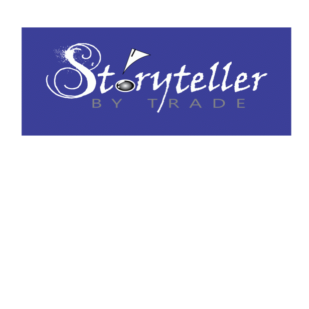
But how does a person translate an oral or written expression such as storytelling into a visual representation? I started with sketches of pen nibs and books, campfires and computer keys – anything I related to the art of getting the story told. In the end I was torn between doing a Rorschach-style inkblot with a stylized version of an S in it for Storyteller, a pair of reflected crescent moons to create an “s”, and the actual title of the blog with the stylized ink font called MoonlightShadow (which I liked because it mimicked the way an old-fashioned pen might write with the splattering). In the final draft of the logo I retained only the S in MoonlightShadow, because it was just too unique to give up despite the level of detail it had. I put the rest of the word in Viner Hand because it was a more simplistic font that still looked very much like it had been inked using a pen. Some kerning was required to get the letters to fit neatly around the ink-drop “o” in Storyteller. This was done using Control M, then using Alt and the arrow keys to move the individual letters around until it looked right.
I created a very simplified pen nib with the “o” in Storyteller being turned into a drop of ink. Trying all three, the wording won, especially since what I saw in the inkblot videos I researched didn’t work nearly as well when I tried it myself and the crescent moon idea didn’t seem nearly as interesting in AI as it had on paper (probably due to my lack of skills to pull it off).

To create the ink drop I used an ellipse shape and a radial gradient. I then used two more ellipse shapes to mimic the first that I applied a linear gradient and lightened the opacity. Finally, I shape blended them to make the “highlights” on the drop and remove the portions I didn’t want to see, then moved some of the points around on the highlight and rotated it until it fit at the edge of the drop.
The By Trade was Segoe font, and selected because the letters are nicely balanced, the san serif font clean and offsetting the messier font of Storyteller. The balance of the letters made it easier to space them apart with kerning to create a shelf of sorts to support the storytelling. I tried using various stroke colors on the letters to see if it might make it better. In the end I decided I liked the way By Trade seemed to blend a little into the background of color making it more subtle and letting Storyteller take the floor visually.
The pen nib was created by first creating a triangle, then using an ellipse to “carve out” the rounded scoop-like shape using the shape blending tool again to cut away what I wanted. A white 3 pt. line segment was added to give the stylistic allusion to the pen nib. The clean lines of the vector image (for the pen nib and lettering beneath) disappeared when I turned it into a jpg file for the blog. In the final version I also used a thin black stroke to make the pen visually sharper. It’s a subtle thing, but I think it helps.
I tried all black versions of this, white on a reversed background with gray lettering for by trade, and the color version you see below in small and larger sizes.
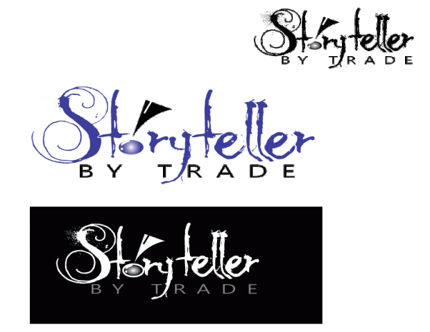
In the final version I selected the reversed version to focus on. It seemed to pop the most for me. Most comments I received on the draft focused on how the font for Storyteller was too detailed to make it neat and clean in smaller versions. They liked the hand inked feel of it, but wanted to see something a little cleaner with the same feeling. I agreed. They also liked the reversed version most. I did too, but I didn’t like losing all color, because it can be such a powerful subliminal message. I tried putting Storyteller in blue on the black background and it simply fizzled. There wasn’t enough contrast to make it work well. So, I tried the opposite and used a fill that was one of my favorite colors (a Tanzanite blue 3c3d98). Not only did it retain the pop of the original draft reverse in black and white, but it gave it a little something extra. Blue subliminally speaks of truth and dependability. Great things to have associated with your storytelling, especially when it’s for a client.
Not having any experience with Adobe Illustrator prior to this class I can tell I am way out of my depth when trying to manipulate tools and use effects. Frankly it’s kind of like asking a kid who’s just taken off the training wheels on their bicycle to hop on a motorcycle and drive it around a timed course. It’s not going to turn out well. What you see took HOURS. Honestly in my mind I would have been better off drawing it by hand, painting it with a paintbrush clutched between my teeth and then just scanning the thing in, but then I wouldn’t have been doing the assignment correctly. So there you go. Hopefully it gets the idea across. Storytelling isn’t always neat and clean. Sometimes it’s messy, but the artistic effort created in ink is supported by the more sturdy, balanced business aspect beneath it.