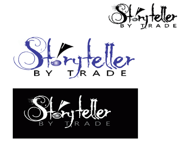
Because our school district introduced a newly redesigned logo just this year, and I was looking at only one aspect of the school district – specifically middle schools, which all have independent logos of their own based on their mascots—it seemed like spinning in circles to come up with a logo that would work for the narrow specifics of my project. Instead, I chose to go bigger and work on a logo that would enfold not just the projects from this semester, but focus rather on the blog showcasing my entire master’s program at WSU.
Of all the readings and links we had this week, one stood out for me in terms of research and understanding the true meaning of being a storyteller by trade: Peter Gruber, CEO of Mandalay Entertainment, wrote this exquisite article for the Harvard Business Review, The Four Truths of the Storyteller For more graphical inspiration I used a Google search for writer logos and the results were awesome.
Here are a couple of my favorites. I love how they transformed the pen nib into something completely unique reflecting their specific niche. Smart Pen Nib Logos More Black and White Logos
But how does a person translate an oral or written expression such as storytelling into a visual representation? I started with sketches of pen nibs and books, campfires and computer keys – anything I related to the art of getting the story told. In the end I was torn between doing a Rorschach-style inkblot with a stylized version of an S in it for Storyteller, a pair of reflected crescent moons to create an “s”, and the actual title of the blog with the stylized ink font called MoonlightShadow (which I liked because it mimicked the way an old-fashioned pen might write with the splattering). I created a very simplified pen nib with the “o” in Storyteller being turned into a drop of ink. Trying all three, the wording won, especially since what I saw in the inkblot videos I researched didn’t work nearly as well when I tried it myself and the crescent moon idea didn’t seem nearly as interesting in AI as it had on paper (probably due to my lack of skills to pull it off).

To create the ink drop I used an ellipse shape, filled that with one of my favorite colors (a Tanzanite blue 3c3d98) and a radial gradient. I then used two more ellipse shapes to mimic the first that I applied a linear gradient and lightened the opacity to. Finally, I shape blended them to make the “highlights” on the drop and remove the portions I didn’t want to see, then moved some of the points around on the highlight and rotated it until it fit at the edge of the drop.
The By Trade was Segoe font, and selected because the letters are nicely balanced, the san serif font clean and offsetting the messier font of Storyteller. The balance of the letters made it easier to space them apart with kerning to create a shelf of sorts to support the storytelling.
The pen nib was created by first creating a triangle, then using an ellipse to “carve out” the rounded scoop-like shape using the shape blending tool again to cut away what I wanted. A white 3 pt. line segment was added to give the stylistic allusion to the pen nib. The clean lines of the vector image (for the pen nib and lettering beneath) disappeared when I turned it into a gif for the blog.
I tried all black versions of this, white on a reversed background with gray lettering for by trade, and the color version you see below in small and larger sizes.

Not having any experience with Adobe Illustrator prior to this class I can tell I am way out of my depth when trying to manipulate tools and use effects. Frankly it’s kind of like asking a kid who’s just taken off the training wheels on their bicycle to hop on a motorcycle and drive it around a timed course. It’s not going to turn out well. What you see took HOURS. Honestly in my mind I would have been better off drawing it by hand, painting it with a paintbrush clutched between my teeth and then just scanning the thing in, but then I wouldn’t have been doing the assignment correctly. So there you go. Hopefully it gets the idea across. Storytelling isn’t always neat and clean. Sometimes it’s messy, but the artistic effort created in ink is supported by the more sturdy, balanced business aspect beneath it.

Hi Theresa. “Storyteller” might be fuzzy if smaller? I could not click on the logo to see. I had that problem before because I forgot to add them as a Gallery, I just attached them and so the photos could not be clicked on. Totally understand your reference to riding a motorcycle because I’ve never used anything remotely like Illustrator. It is both good and bad because I feel like I a missing so much more that I could be using. I think you are using a good style for your logo because it draws attention; it is similar to other reading related type logos that I have seen. I like the black background logo because it has edges. But I like the blue color for the font in the other one. Great work! =)
LikeLike
Hi Theresa,
Your blog is very well done! It’s a pleasure to read. Your logo is also very creative. I love the way you’ve been able to give each letter a “personality” of sorts. The feather and the ink plate is also a nice addition. I think your logo will also work well with any background and color scheme. The more I looked at the logo, the more I started to associate different themes with your work: the font choice made me wonder if your wrote horror stories, but then the “spray” effect on the S made me think of fantasy. I think all of these effects with the graphics are so strong that together they may create too much to visual at the same time. I think your logo could be further enhanced with simplifying some aspects of it – maybe the graphic with simpler font or the stylistic font without the graphic. I also like the idea of being able to have a hint of what stories you tell by looking at the logo. In a weird sort of way, it creates some excitement and anticipation.
Best of luck,
Nola
LikeLike
Hello Theresa! I have to say I love the font you chose for ‘Storyteller’… it captures both the whimsical and dark aspects of stories and even conveys the nighttime setting of a campfire as noted in your initial drawings. Looking at the design and considering its scalability, I would suggest slightly lowering the font size of ‘by trade’ since the san serif font is so bold. This will then draw the eye first to ‘storyteller’ and give it emphasis. Also perhaps changing the shape of the ‘o’ to more of a drop shape, while still looking like an ‘o’, would help connect this to an ink drop from the nib. I am impressed with how you were able to use ‘simple shapes’ and complex techniques to construct the nib–way to go! Have you tried the blue logo in the black background? I like that background setting, and wonder how it would look with the colored ‘storyteller’.
LikeLike
In looking over the comments I’ve been given on the draft of my logo, I can say one thing for sure: the devil is in the details. While I love the font and may even keep the S from it, I can see that perhaps the detailing in the Storyteller word in the first draft might be too detailed to translate easily in a smaller form. I plan to look at ways I can streamline the rest of the word to give the illusion it is still ink, without perhaps the high level of detail the font currently requires.
The comparison of creating it in black and white, color and then reversed help me to see the visual impact it could have in several different settings. Personally the white lettering on the black background had the most pop for me visually. I’d like to see how I can further enhance that one version and will be working with it more in the final draft.
LikeLike