Let me tell you a story…draft edition

This week’s project was easier for me than the graphic work we’ve done previously – probably because I tell stories all the time. So coming up with the story of our community and the challenges it’s facing with redistributing our kids and changing our school system wasn’t hard. Determining how to do it was a bit more challenging.

I knew I liked the format of All Things Considered from National Public Radio. I’ve written enough scripts for radio that I knew I could do most of the voice work myself. To begin, I wrote out the elements I thought I’d like to include: an interview, sound B roll under my voice as I explained things and perhaps music. I tried to think of it as a movie with no picture, if that makes any sense.

While working on the script and story line for this piece I knew I wanted two sounds that people could identify with no matter where they live which would give them both an idea of our community and link into the basis for the story all about changes in the school district: the sound of waves lapping against the shore and children playing at school recess. Using those I could set the tone of the story and paint a mental image to go with what was being said.

For the wave sound used in the introduction and exit, I took my iphone, with the Voice Record Pro app on it (purchased for $2.99) and went to one of the nearby parks in town located on the water’s edge and took about a 1 minute recording then emailed the recording to myself to be able to download it into Audition. Since school has been out for the summer for two weeks now, I knew it would be difficult to get the sounds of children playing on the school ground and I knew taping it at any of our local parks would leave me open to extra ambient noises since most of our parks are near waterways, roads or construction zones for the time being. I relied instead on a recording called Kids playing on school-years by Caquet found at freesound.org 

I also interviewed a member of the community committee that had worked on determining how our schools would change. Specifically I picked out what that I knew well enough to know she had public speaking skills, so the interview wouldn’t be full of ums, ahs and other assorted sounds that would have to be cut out to make the interview sound clean. I also knew she had just had a sixth grader “graduate” from our school, so she was a prime person to look at things from the prospective of a parent who’s child is going to be directly impacted by the shift in our system in the next two years which would give her authenticity when talking about what concerned parents of kids moving into a middle school model. I wanted this to be an educational piece , not just about education as a subject, but actually educating listeners on how middle schools were different and why our community chose this change. The original interview went slightly over nine minutes in length.

Once I had my different elements recorded on my phone or located on the Freesound.org site I pulled them into Audition. The commentary recordings I did were cut into the most pieces and stitched together based on how much time I needed to cut to get the interview bits I wanted to fit in the allotted time frame for the overall piece. I also began to slice out snippets of the interview I thought would work and placed my commentary, her interview, and the background sounds all into separate tracks in a multi-track view. From there I listened to the interview and sliced it according to natural breaks in her speech patterns so I could use the pieces I needed to still get the story across and come in under the time required. I did the same for my commentary. Then using the fade tool, I adjusted the background sounds of the waves and children playing and adjusted their volume levels to make them fit around the commentary and interview like bookends, bringing the story around full circle in sound. I deliberately transitioned the sounds from the waves to the school children at the point where I stop talking about the community and start talking specifically about the schools. I also faded out the background sounds once we get to the interview, partially because I had to kick up her vocals more since my phone was further away from her than me and recording her voice more faintly. I didn’t want background sound to compete with what she had to say.

I listened to the tracks multiple times with my eyes closed just to focus in on the audio more clearly. I’ve included all the clips that went into the piece, the last track is the finished draft. Listen and let me know what you think. 
Make Some Noise – Audition Tutorials

This week we took another facet of Adobe for a spin – Audition. The sound editing software that took me right back to broadcasting editing with Professor Lingle in the 90’s. Only we didn’t have anything this easy to use. We had digital editing equipment that had dials to key in to places where you wanted to cut and splice tracks together. Then again, I also used a hot wax machine at my first job in the newspaper industry to paste together the pages, so there you go. Things change. Fortunately sound stays the same.

In keeping with my subject matter for this semester I chose to interview one of the community members who participated in the reconfiguration committee. These folks spent over a year looking at the idea of transitioning our district from the current junior high and 10-12 high school to middle schools and a 9-12 high school. After delving into all the research, best practices and so forth, they decided it was the best idea for our students in the South Kitsap School District. Full_logo_with_text_and_NIB (2)

On a side note, the woman I interview just had her 6th grader graduate from elementary a week ago, so she’s knee deep in how this all plays out because it will directly impact her children. Having some skin in the game really does make you think of things differently.

I did an interview with her, which ended up being audio only (because my phone didn’t have enough storage after my daughter going to Prom and graduating from high school the same week because I hadn’t downloaded all the pictures and video yet). From that interview I selected a clip I thought followed many of the guidelines given to us in our tutorial readings. It tells a short story. It has a definite point. And more importantly, it’s kind of fun. You can tell she’s a real person dealing with this whole tween thing so common among kids in the middle school age group.

For our 30-45 second tutorial clip I did have to edit some of her natural pauses down a bit to get it to come under the length requirement. I also had to edit my own introduction and restructure it a bit when I found I talked too much! It was more important to showcase her story in this case.

The counting tutorial was interesting too. It was so much easier to move around audio using this program, and far more intuitive than using the programs and equipment I’ve had to previously to accomplish the same thing. Finally, an Adobe program that is actually fun to use!

So, without further ado, here are the four tutorial audio clips including both raw material and the finished product for each tutorial.

SoundCloud Files


Tinkering with AI – final logo

Because our school district introduced a newly redesigned logo just this year, and I was looking at only one aspect of the school district – specifically middle schools, which all have independent logos of their own based on their mascots—it seemed like spinning in circles to come up with a logo that would work for the narrow specifics of my project. Instead, I chose to go bigger. I worked on a logo that would enfold not just the projects from this semester, but focus rather on the blog showcasing my entire master’s program at WSU.

Of all the readings and links we had this week, one stood out for me in terms of research and understanding the true meaning of being a storyteller by trade: Peter Gruber, CEO of Mandalay Entertainment, wrote this exquisite article for the Harvard Business Review, The Four Truths of the Storyteller  For more graphical inspiration I used a Google search for writer logos and the results were awesome.

Here are a couple of my favorites. I love how they transformed the pen nib into something completely unique reflecting their specific niche.  Smart Pen Nib Logos  These were equally awesome More Black and White Logos

But how does a person translate an oral or written expression such as storytelling into a visual representation? I started with sketches of pen nibs and books, campfires and computer keys – anything I related to the art of getting the story told. In the end I was torn between doing a Rorschach-style inkblot with a stylized version of an S in it for Storyteller, a pair of reflected crescent moons to create an “s”, and the actual title of the blog with the stylized ink font called MoonlightShadow  (which I liked because it mimicked the way an old-fashioned pen might write with the splattering). In the final draft of the logo I retained only the S in MoonlightShadow, because it was just too unique to give up despite the level of detail it had. I put the rest of the word in Viner Hand because it was a more simplistic font that still looked very much like it had been inked using a pen. Some kerning was required to get the letters to fit neatly around the ink-drop “o” in Storyteller. This was done using Control M, then using Alt and the arrow keys to move the individual letters around until it looked right.

I created a very simplified pen nib with the “o” in Storyteller being turned into a drop of ink. Trying all three, the wording won, especially since what I saw in the inkblot videos I researched didn’t work nearly as well when I tried it myself and the crescent moon idea didn’t seem nearly as interesting in AI as it had on paper (probably due to my lack of skills to pull it off).IMG_2203IMG_2204

To create the ink drop I used an ellipse shape and a radial gradient. I then used two more ellipse shapes to mimic the first that I applied a linear gradient and lightened the opacity. Finally, I shape blended them to make the “highlights” on the drop and remove the portions I didn’t want to see, then moved some of the points around on the highlight and rotated it until it fit at the edge of the drop.

The By Trade was Segoe font, and selected because the letters are nicely balanced, the san serif font clean and offsetting the messier font of Storyteller. The balance of the letters made it easier to space them apart with kerning to create a shelf of sorts to support the storytelling. I tried using various stroke colors on the letters to see if it might make it better. In the end I decided I liked the way By Trade seemed to blend a little into the background of color making it more subtle and letting Storyteller take the floor visually.

The pen nib was created by first creating a triangle, then using an ellipse to “carve out” the rounded scoop-like shape using the shape blending tool again to cut away what I wanted. A white 3 pt. line segment was added to give the stylistic allusion to the pen nib. The clean lines of the vector image (for the pen nib and lettering beneath) disappeared when I turned it into a jpg file for the blog. In the final version I also used a thin black stroke to make the pen visually sharper. It’s a subtle thing, but I think it helps.

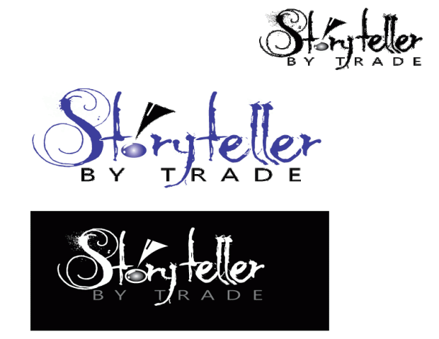
I tried all black versions of this, white on a reversed background with gray lettering for by trade, and the color version you see below in small and larger sizes.

Logo-Composite

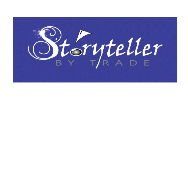
In the final version I selected the reversed version to focus on. It seemed to pop the most for me. Most comments I received on the draft focused on how the font for Storyteller was too detailed to make it neat and clean in smaller versions. They liked the hand inked feel of it, but wanted to see something a little cleaner with the same feeling. I agreed. They also liked the reversed version most. I did too, but I didn’t like losing all color, because it can be such a powerful subliminal message. I tried putting Storyteller in blue on the black background and it simply fizzled. There wasn’t enough contrast to make it work well. So, I tried the opposite and used a fill that was one of my favorite colors (a Tanzanite blue 3c3d98). Not only did it retain the pop of the original draft reverse in black and white, but it gave it a little something extra. Blue subliminally speaks of truth and dependability. Great things to have associated with your storytelling, especially when it’s for a client.

Not having any experience with Adobe Illustrator prior to this class I can tell I am way out of my depth when trying to manipulate tools and use effects. Frankly it’s kind of like asking a kid who’s just taken off the training wheels on their bicycle to hop on a motorcycle and drive it around a timed course. It’s not going to turn out well. What you see took HOURS. Honestly in my mind I would have been better off drawing it by hand, painting it with a paintbrush clutched between my teeth and then just scanning the thing in, but then I wouldn’t have been doing the assignment correctly. So there you go. Hopefully it gets the idea across. Storytelling isn’t always neat and clean. Sometimes it’s messy, but the artistic effort created in ink is supported by the more sturdy, balanced business aspect beneath it.Draft-Logo-Storyteller-reversed-colored-background


Wrestling with AI – draft logo

Because our school district introduced a newly redesigned logo just this year, and I was looking at only one aspect of the school district – specifically middle schools, which all have independent logos of their own based on their mascots—it seemed like spinning in circles to come up with a logo that would work for the narrow specifics of my project. Instead, I chose to go bigger and work on a logo that would enfold not just the projects from this semester, but focus rather on the blog showcasing my entire master’s program at WSU.

Of all the readings and links we had this week, one stood out for me in terms of research and understanding the true meaning of being a storyteller by trade: Peter Gruber, CEO of Mandalay Entertainment, wrote this exquisite article for the Harvard Business Review, The Four Truths of the Storyteller  For more graphical inspiration I used a Google search for writer logos and the results were awesome.

Here are a couple of my favorites. I love how they transformed the pen nib into something completely unique reflecting their specific niche.  Smart Pen Nib Logos  More Black and White Logos

But how does a person translate an oral or written expression such as storytelling into a visual representation? I started with sketches of pen nibs and books, campfires and computer keys – anything I related to the art of getting the story told. In the end I was torn between doing a Rorschach-style inkblot with a stylized version of an S in it for Storyteller, a pair of reflected crescent moons to create an “s”, and the actual title of the blog with the stylized ink font called MoonlightShadow  (which I liked because it mimicked the way an old-fashioned pen might write with the splattering). I created a very simplified pen nib with the “o” in Storyteller being turned into a drop of ink. Trying all three, the wording won, especially since what I saw in the inkblot videos I researched didn’t work nearly as well when I tried it myself and the crescent moon idea didn’t seem nearly as interesting in AI as it had on paper (probably due to my lack of skills to pull it off).IMG_2203IMG_2204

To create the ink drop I used an ellipse shape, filled that with one of my favorite colors (a Tanzanite blue 3c3d98) and a radial gradient. I then used two more ellipse shapes to mimic the first that I applied a linear gradient and lightened the opacity to. Finally, I shape blended them to make the “highlights” on the drop and remove the portions I didn’t want to see, then moved some of the points around on the highlight and rotated it until it fit at the edge of the drop.

The By Trade was Segoe font, and selected because the letters are nicely balanced, the san serif font clean and offsetting the messier font of Storyteller. The balance of the letters made it easier to space them apart with kerning to create a shelf of sorts to support the storytelling.

The pen nib was created by first creating a triangle, then using an ellipse to “carve out” the rounded scoop-like shape using the shape blending tool again to cut away what I wanted. A white 3 pt. line segment was added to give the stylistic allusion to the pen nib. The clean lines of the vector image (for the pen nib and lettering beneath) disappeared when I turned it into a gif for the blog.

I tried all black versions of this, white on a reversed background with gray lettering for by trade, and the color version you see below in small and larger sizes.

Logo-Composite

Not having any experience with Adobe Illustrator prior to this class I can tell I am way out of my depth when trying to manipulate tools and use effects. Frankly it’s kind of like asking a kid who’s just taken off the training wheels on their bicycle to hop on a motorcycle and drive it around a timed course. It’s not going to turn out well. What you see took HOURS. Honestly in my mind I would have been better off drawing it by hand, painting it with a paintbrush clutched between my teeth and then just scanning the thing in, but then I wouldn’t have been doing the assignment correctly. So there you go. Hopefully it gets the idea across. Storytelling isn’t always neat and clean. Sometimes it’s messy, but the artistic effort created in ink is supported by the more sturdy, balanced business aspect beneath it.


The Mind is Like a Rubber Band

If the mind is like a rubber band, then mine, dear reader, has snapped. This week’s work in Adobe Illustrator reminded me why I chose to work in the PR side of agency and not the Advertising and Art side. While I’m not a creative klutz ( I can paint and draw using my hands and not a computer), these kinds of programs are so unnatural to me that I sincerely struggled with recreating the tutorials.

In the end, no matter how often I re-watched the online video tutorial I couldn’t make the program do what the video said it would do. Watch. Do the steps. Get a warning that it wouldn’t make a clipping mask. After a half hour of repeating this process I figured the computer was more stubborn than I was.

It makes me concerned, and not a little bit anxious, to consider how I will use this tool to create a logo next week. Hopefully I can get a new rubber band by then.

Fist-logoPencilBannersVarsity-Letteringto-do-icon